30.9.13

Mag Mad - AnOther

And lastly of the reviews is AnOther. (Yep the o is meant to be capital)

AnOther 
Issue - 25th Issue Biannual Autumn/Winter 2013
Price ( I paid) - £12.05
Editor - Jefferson Hack

AnOther magazine is another one I haven’t read before, yet it stood out for me with its cover image and use of unordinary text. Even before noticing any of anything else, there was a lot of advertising fall out from it; they seem to have a lot of free mini zines inside, obviously from advertisers which I personally find quite annoying – I want to read the magazine I’ve bought, not free adverts which generally aren’t that great to look at or read. However after that, I noticed the cover is actually a fold out, with a double page spread advert on the underside taken by Dolce & Gabbana; an obvious expensive space to buy. The title is easy to read and grabs your attention straight away as you look at it. Also I like the serif font used; it provides a contrast between a seemingly old looking font with the modern content inside. I like how they’ve got ‘Magazine’ written perpendicular to the title in smaller font as well, it ads something to quite a simple cover. Simple covers are some of my favourites, just because too much text can be quite cluttered and you get all the same info from the contents inside.

It has an easy contents page to navigate, again quite graphic in its layout and different from the norm. They follow a two-three grid and column format throughout which I like as it’s clearly laid out. I’ve also noticed that the gloss of the pages seems a lot higher than other magazines, but that may just be me but nonetheless it looks nice. I think the general size of the magazine is slightly bigger than A4, again I like because it’s a tad different.  

They don’t use imagery in the typical way other magazines do; some images fill the entire page and others are placed around the page with the white background. Having to make a magazine in my first year of university I’ve learnt you can do this, and it looks quite nice if the imagery speaks for itself. They generally have accessories filling the pages when talking about them and editorial centering the pages. In saying that, they also have editorials towards the end of the magazine that fill the pages, probably because the imagery is quite striking.

Before the beginning of each editorial, they have what reminds me of a mind map page with quotes on, which works quite well to explain the imagery you’re about to see. For a magazine which is meant to be fore both men and women’s fashion, the editorials focus more on women which is of course fine by me because I am one! Generally the 
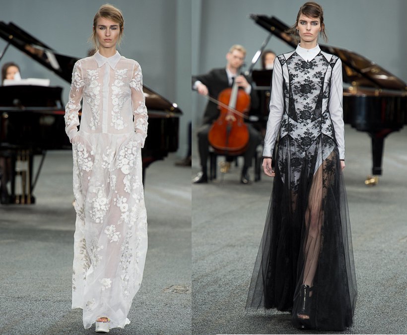
editorials I feel are really strong and quite quirky, some of the imagery has been manipulated and is very interesting to look at, so if you haven’t looked at the latest issue I’d definitely have a look if you can find it on a newsstand, as it is quite pricey at over £10.


Overall I feel this is my favourite out of them all just because of the variety and the editorials are done really well and are quite quirky and different to what you see everyday. Out of the three, which would be your fav?

Mag Mad - V

Second on the list is V!

V Magazine
Issue - Fall, Issue 85
Price ( I paid) - £10
Editor - Stephen Gan


The first thing you notice about V is the paper size. It’s A3, which isn’t typical of high -end fashion magazines, but I like it, as I feel you can see more of the images. I have found magazines that are this size generally have more editorial than features in them, which isn’t necessarily a bad thing and have found this is definitely the case with V.

The cover has minimal content, using san serif font instantly giving it a modern feel. Moving onto the contents page, they introduce serif fonts in the main body text but generally use san serif fonts throughout which I like. Also I feel the font is quite small but compared to the page size, it makes it feel like when the page is full of text that you’re getting a lot of information. The text width grows from close together to quite wide in their title fonts, which again emphasizes its graphic nature, yet is still easy to read. The stand out title of the magazine covers the whole front image, and takes on a different matter texture compared to the majority which is gloss and is something I really like. This is also they’re signature attribute that they use on every issue, again emphasizing there identity in the magazine industry.

Graphically, I feel it’s strong and the imagery used throughout runs consistently. They vary from a one, two and three grid and column system; with the majority of one column pages being on less important ones such as the contents page, where the images behind take president. Although they are a lot of ads alike Paris Vogue, you get straight into content it seems a lot sooner and you get a lot of it with a tiny dose of an advert here and there but it’s not as noticeable to some magazines. Stories range from interviews with Oprah Winfrey and Lee Daniels and their cover star Lady gaga. The ‘Icons’ feature was lovely to read as they feature content from Cher to Liza Minnelli. The set up on a page makes it easy to read and has fluidity into the next without seeming too dramatic of a change.

The balance between fashion and lifestyle is good; it particularly focuses on editorial, which are really striking and thought made the magazine quite unique. One article featured photography by Bruce Weber, which I’ve previously looked at as part of my degree, so it was nice to see some more of his work in a current publication.


With it only being their 85th issue, I really enjoyed reading V, its nice to have a change from Vogue and ELLE, which sometimes I feel you get the same from, even with the revamp that ELLE had last year. However, it’s not an easy one to carry around with you if you have little space and arm strength due to its size.

Mag Mad - Paris Vogue

Over the summer, I was set the task of reviewing some fashion magazines. From the list I was given, some looked more familiar than others. I thought I'd post them on here to get your views as well on any of the magazines I mention over the next three posts to see if you're a dedicated reader and agree or disagree with me, hope you enjoy!

Paris Vogue
Issue - September 13
Price (I paid) - £7.85
Editor - Emmanuelle Alt


Vogues iconic masthead is recognisable on newsstands around the world. The Vogue brand is so global; it’s available in over 27 countries, so you’d expect to see some similarities within each countries edition. Of course the first thing you notice that is similar is the masthead. The Vogue font is always consistent, however can change colour depending on who’s fronting the cover that month and what the colour scheme is. I’m glad the paper type and size is the same for the continuity again also.

British vogue varies between the use of serif and sans serif fonts on their cover and throughout, however on Paris Vogue, the cover is only serif fonts. This may be because they wanted to keep the consistency with the masthead font, which is of course serif also, which I quite like however it is nice to see a variety. This difference may be due to giving it a slightly different identity to other Vogues, to make it easy to establish as Paris Vogue.

Stylistically, it seems that they use a two/three grid system, which again is similar of British Vogue that I’m used to but I feel they’re quite afraid to fill the page still. When generally skimming the magazine, I did not come across one full page of a news feature, even the one stated on the cover that the issue was based around. Also, before reaching any sort of contents, there are about 100-150 pages of adverts; about double compared to British Vogue, which I find hard work. I don’t mind adverts but at least give some sort of content to break it up such as the contents nearer the beginning. This particular issue is based around ‘Grunge’ and seeing as September is the January of fashion I was expecting a lot of clothes, and a lot of editorial showcasing this. However I did not get this. The editorials start 380 pages in which I personally think is ridiculous. When you get to the editorials, they seem disjointed, like a couple of images have accidentally been printed in the wrong place. They have a black and white theme running throughout with the use of two models and then you turn the page and suddenly have a colourful beauty shot which looks totally unrelated to the editorial. There is a Miss Vogue editorial they have slightly earlier on from page 264, with the themes’ The Breakaway Beautiful’ and ‘Attitude’ which looks a lot more put together, but still quite ‘samey’ also.

They dedicate a huge chunk of the magazine to beauty, which I like as you get a lot in other Vogues, but the layout of it is confusing and may seem like a lot but when you strip it back, there really isn’t all that much

The overall feel of the magazine seems quite amateur-ish, with a lot of ads throughout, which may not just be to fund it but to fill space where content is lacking. Some editorial is nice but you have to fish your way through the whole magazine to get to it.

17.9.13

September LFW 13 Round Up

Another September another Fashion Week down! New York went quick but LFW always flies and what a cracker it was. I must say I don't look forward to the SS shows as much as the AW just because I generally enjoying seeing winter clothes over the summer ones but nonetheless I had some definite favs of the week and a couple of disappointments.

I usually always enjoy Topshop Unique, winter or summer as they always put on a good show but I was really disappointed by the collection this season. It definitely lacked wow factor for me, even if Cara was opening and closing it. It could of been because last season they introduced a new interactive feature called 'model cam' which enabled viewers to see what the models were seeing with the use of cameras placed in their bags. This was interesting and new and the catwalk space was not the norm. All these features paired with the good collection made it really good and this year just didn't live up to it for me, sorry Toppers!


On a happier note, a show that never fails to deliver for me was Mulberry. The simple english heritage vibe it has always radiates through on the catwalk. I loved their use of brights, stripes and the matching totes were amazing. I'm also glad to see white is well and truly in again for next year. To top it all off, the British bull dog Turbo in his matching floral print mac was priceless! I don't know is this is becoming a permanent thing but I don't mind if it is; super cute.


Lily Coles interpretive dance was a er, different way of opening a fashion show this season but Vivienne Westwood has has always been a wild one, and this season was no different. None the less I thoroughly enjoyed it. The clothes themselves seemed quite tame, and there was one dress in particular, a navy 3/4 length sleeve shift dress which I could def see myself in. Not quite sure what I made of the zombie-esque make up but that can be over looked when the clothes are nice. Her Red Lebel signature draping neck lines were back as well which I loved.


My final fav would just have to be Erdem. I just found the collection absolutely beautiful; the lace dressing and ruffle trimming was stunning and just made me instantly feel summer after seeing it espesh in this sudden burst of cold weather. Also the majority of it was monochrome which of course is a winner for me. I did get a slightly gothic vibe for SS but I didn't mind it.


So these are just a few of my favs from this seasons LFW, were there any stand out shows for you?

16.9.13

Beckham Belstaff

David Beckham - dare I say more? He was on hand last night (Suday September 15th) to launch the new Belstaff store on Bond St. He saucily arrived on a motor bike in a sort of brigade with a group of other men and women. For some reason I thought I might have dreamed this before.. but anyway back on topic...


I think this is really clever marketing on Belstaffs behalf. It's hot topic right now that men buy clothing not fashion, and are just as easily influenced by celebrity endorsements as any women. It's no surprise to anyone that David Beckham is a handsome chap and men would be lying if they didn't want to be him, so what's the easiest way to do this? Buy the clothing he is seemingly seen to be wearing! Of course if he's been used by the brand he will all of a sudden be caught wearing everything and anything of their latest collection so men will see this, and be more intrigued by the brand.

Of course Beckham must have liked the brand otherwise he wouldn't want to put his name to it otherwise. It's also important that they launched during LFW, a crucial time for any brand. Clever Clever Belstaff. The amount of times I've written Belfast in this post by accident!


McCartney X Goop


Gwyneth Paltrow and Stella McCartney's fashion line is here! The duo have paired up to create a line for Paltrows Lifestyle site Goop. Officially named McCartney X Goop, the line launched September 12th and is said to echoes Paltrows style; 'timeless and effortless.'

At first glance, I expect there to be a lot more. It definitely defines 'capsule', or even smaller to be honest and there are only currently 6 items available on her site (www.goop.com) two of which are bags. However, the pieces that are there are timeless. It includes a black blazer, black staple pair of jeans, black jersey trousers and black jumpsuit. All I can say is black. And seeing as I love black of course it's a hit in my book!

As well as liking the clothes, I also quite like the graphics of it. I like how they've kept Stella's signature dotted font paired with Paltrows 'Goop' font from her site. The pink X ties it all together and is easily recognisable. All in all, it gets a thumbs up from me, and I'd be intrigued to see what else they bring out in the near future. It's a shame it's all CRAZY expensive with the blazer being £1,895 - tad out of student budget once again.


15.9.13

The Glamour Of Bellville Sassoon


The high end British fashion salon Bellville Sassoon is having a retrospective at the Fashion and Textiles Museum this September. Running from the 20th to January 11th 2014, you have plenty of time to see it between now and Christmas.

Sassoon has been synonymous with the british high street for over 50 years. Founder Belinda Bellville and designer David Sassoon, who I was lucky enough to have a talk from at my Uni last year, have dressed the worlds most stylish women, such as Princess Diana.

Maternity wear for Princess Diana by Sassoon

Tickets are available on the day and cost £8 adult and £5.50 student so be sure to get down there between now and January, I know I will be.

All Saints & Victoria Beckham At NY Fashion Week?

As we all know, Victoria Beckham is from the UK. Yet I find it quite surprising that she currently only shows her collections at New York Fashion Week, yet she is a UK based designer. As well as VB, the English retailer All Saints has now jumped ship are gone over seas to New York to show for the first time their Spring/Summer 14 collection. Why is is that designers do this as soon as they gain commercial success?


In a talk with Victoria at the Vogue Festival this year, she said she feels 'settled' with her brand being in New York and each year she's shown there has got a good response. Should British designers though only be able to show at LFW or chase the money? Well, at current it seems they all they want to do is chase the money. If it were me, being a British designer, it would be important for me to gain success in the UK first, but I'd be lying if someone said you'd make money here too so go there also. People would be lying if they said they went into business SOLEY just because they love what they do, money plays a huge part.

With All Saints, I still feel they'll flourish here in the UK, as we'll get to see their collections for each season first. The fact they've shown only once in NY doesn't mean they will in the near future. With concerns to the British High Street, I don't feel this will have a huge impact, fans of the brand will continue to buy. It's only when we become second best to whats coming out then problems might occur.

'The King Of Fashion Illustration'


Antonio Lopez was a famous fashion illustrator back in the 60's. He's had his work published in Vogue, Harpers Bazaar, ELLE, and even The New York Times. He's been named the 'king' of fashion illustration and an exhibition of his work is being shown at Rowland Mouret's Townhouse from September 14th - October 20th. He sadly died at the age of 44 from AIDS so won't be there of course, but if you're a fan of his work or fashion illustration in general I would go down for a peak.

The exhibition would of marked his 70th birthday and as well as being able to see his work, it is being auctioned off so is available to buy. A lot of the work being auctioned off is unseen, curated by Janina Joffe from the 1960's to 1980's created for magazines such as Interview and Vanity.

His relevance today is still present, as MAC cosmetics are bringing out a limited edition range in his honour. They've previous done collections using Wonder Women, Beth Dito, Marilyn Monroe and the Viva Glam Nicki collection, so they have clearly cottoned on to his amazing graphics and use of colour and wanted to use it to display a new range. With the exhibition started around the same time are the launch, it's good publicity for them. As a fan of MAC products myself, I will definitely be going in my local to have a look at the collection.


Below are some of my favourite works from Lopez, do you have any personal favs?


It Would Be An Honor


New York label Honor has come to the UK! It will be available via the designer online store Matches and is available as I type.

The brand is said to be similar to that of Miu Miu, but more affordalble. With the cheapest item being a silk blouse at £575, I wouldn't exactly call that affordable but compared to a similar tee from Miu Miu which is around a similar price, it could be seen as that to people who buy designer on a regular basis.

Taking a sneaky peak at their runway collection from last years New York Fashion Week, it's a brand packed full of colour, and fun colour at that. Giovanna Randall, who founded the brand back in 2010, has used a range of pink hues, pretty prints and girly trims.


I can definitely see a resemblance to Miu Miu, specially with the use of embellishments and I have my eye on a really fun twin heart blouse with matching trousers. But at $950 each, its slightly out of a students price range. What are your thoughts on the brand?

WANT WANT WANT

The Making Of Liberty


Channel 4 are in the mists of making a fly on the wall documentary about Liberty of London on London's famous Regent St.

When it comes to Liberty, I think it's much over looked because of how big Selfridges is, which or course is not far from it. As well as Harrods which will forever be iconic to me.

To be aired this Autumn, 'Making Liberty' seems to be reminiscent of a similar documentary about Claridges (Inside Claridges) which was on around the same time this is meant to be aired last year. Did Liberty spot a beacon here? It could be that it saw the success Claridges received from the documentary and wanting to bring life back into the store (especially on the run up to Christmas, a crucial shopping time) since it's so overlooked.

The documentary follows the managing director Ed Burstell and head of marketing communications Kate Brindley around in the lead up to Christmas. He said 'the show will follow us through fashion week and in all the buying meetings; there's a real focus on the business of fashion.' They hope to bring a 'new customer' in with the documentary - well let's wait and see!

I'm personally quite intrigued to watch the three-part series as soon as it airs. Let me know your thoughts on the upcoming programme.

The Work Of Robert Mapplethorpe


Robert Mapplethorpe is known for his large-scale, highly stylized, black and white portraits, flowers and portraits, and of nude men. He was huge in the 70's and 80's until he died of aids at the end of the decade. Looking over his work now, is it the right time for a resurgence for Mapplethorpe? Or does it seem dated I hear you cry? 

He loved to do portraits of flowers, especially orchirds and calla lillies. However, a huge amount of his work focused on homoerotica and BDSM. His X Portfolio was one of his most explicit, featuring imagery which sparked huge controversy in his travelling exhibition, The Perfect Moment, as it was funded by the National Endowment for the Arts.


Andy Warhol & Grace Jones by Mapplethorpe.

Jennifer Jakobson 1980, Self Portrait 1980/1999, Miguel Cruz 1986

German GQ recently relived his work using James Franco. I think this was a clever move on their behalf as he's quite current in the film industry right now so it's making people aware of his work, that maybe weren't before.


His sexually charged photos of black men where critiqued for being exploitive. Would I see his work as becoming relevant today? I'm not sure. Being in the age of the 'water shed' and having systems such as Ofcom where people can complain about the silliest of things that can be seen as offence to them or not acceptable viewing for their children I think the reaction wouldn't be good.

However, some of his fashion imagery I feel is still quite nice such as the above image of Grace Jones, a long with his inoffensive portraits with Andy Warhol. I like black and white imagery, and don't view it as dated but classic, and would easily browse through more of his work like the above.

If intrigued, do google his work, but be aware some of it is quite 'out there' to say the least and isn't for the faint hearted so do so with caution. 

14.9.13

LFW 2013 Feat. Oxford Street


Already an iconic fashion capital, London is adding a twist to this Septembers Fashion Week by joining with Oxford Street. There will be flags displaying A/W catwalk images from the likes of Giles, Alice Temperly and Topshop Unique.

Fashion emporiums from Selfridges, Topshop, River Island to John Lewis, House of Fraser, H&M and GAP will provide shoppers with a range of exclusive experiences, and insider insights into the world of national and international fashion. I think this is a really good way of getting the high street back on the map, since it seems to be fleeting away according to some.

As I type, LFW is in full swing, so will post my favs from the week once its all over, so until then, enjoy!

11.9.13

Fit Over Thin?

There's always been a craze for people to be thin within the fashion industry, but recently it's all about being fit. There are so many twitter accounts I've seen in the last couple of months that are all about being healthy and getting fit; they promote healthy eating and exercises with recipes. I think the so called 'inspiring' imagery they post however might be a step too far. But none the less I think it's so much better to promote being fit compared to thin as the industry is notorious for hirering overly thin girls, they need to take a leap out of the twitter accounts books.

So many people have tried to change the industries ways, and I guess it has changed a little but still it's not completely there but if more model castings looked for fit rather than thin girls, people would let up on them.

  vs

Trying To Make It's Mark


Marks & Spencer's have been a well loved well established brand for a while now, but over recent years have seemed to have lost their way a bit. They as a company can see that and as a new ditch attempt have created this new 'Leading Ladies' campaign. Shot by Annie Lebovitz for a reported £100,000 a day, you'd hope for them they'd bring something out of the bag. And I don't think they've failed in doing so.


I won't lie when my mum came back from a shopping trip with a friend with a HUGE M&S back recently I did think all she'd pull out where basic crew neck jumpers and t-shirts but I was pleasantly surprised. She informed me of how much she liked in there and was also very surprised and things she saw. She pulled out an oversized biker jacket with faux leather trimming, a red leopard print jumper, also with faux leather trimming around the sleeve and bottom edges, some contrast heel boots and many other faux leather laden goodies! After seeing all this I did a bit of googling and found the campaign and also took a quick look at the collection. It is fair to say they've really tried to up their game. I know they have a few different collections within the brand aimed at different age sections such as Per Una and Autograph and you can tell they've catered for everyone within each one of these but still kept the focus very much on the fashion.

My mums comment would be that she absolutely loves the new collection and campaign, she has since the shopping trip bought more things and is on the look out for a few others which seems to be unavailable online. She has also checked out local stores, none of which have the items in stock either. This is the only thing which she doesn't like, the collection seems so popular it's either out of stock or not even available in our stores yet. The first bits she got were from the Marble Arch branch which may be why as they're a flagship so get things before other smaller stores. But she is very impressed which I guess is a good sign from them, well done M&S!


Black Is Beautiful

Super model Iman has recently said that more brands need to include black models in their shows and campaigns or risk people boycotting them. I don't think they'll be boycotted as such but I do think a more diverse use of models could and should be used. All being the same is boring, and brands are tending to stick to a certain type of girl for a show or campaign each season and not budge. This needs to change especially in such a fast moving industry as this, brands should be moving and changing with the times to stay current.


Brands know they'll stay in business even if they do carry on the way they are but they should keep it exciting by adding variety to their shows. In New York Fashion Week 2013, black models made up a mere 6% of the models booked; this is a 2% dropped from the previous year. But why is this? I just don't know is the answer. Maybe their are so many black models out their not getting recognised as only a handful at present are seen as 'supermodels' as such Iman and the more recent Jourdan Dunn who now has world wide success with a number of brands. Let's all hope the industry soon wakes up and uses more black models.

Has Tom Ford Lost His Fashion Crown?

According to Colin McDowell in a recent talk head at my university, Tom Ford is no longer relevant in the fashion world. However since then, he's opened up a store on Sloane St - of course an expensive retail space so does this beg to differ? I think so. Along with the store launch came an exclusive new fragrance, Private Blend London which is described as being 'rich' and 'spiced.'

It seems to me that if he is was dying out to the fashion world, he's trying to claw his way back with this store and a perfume named after the location it's being set up in. We're all a sucker for a gimmick so I think it will do well.

In the new store is also a unique section allocated for make up and fragrances, but not just fr women but for men also! Is she taking it too far by having make up for men? The amount of products on the market these days for men would probably beg to differ but the average man I believe would have to draw a line at make up. It's right for a certain market, maybe one that can afford Tom Ford, but the majority in this economic climate cannot so I don't think it will be a smash hit. Nice try though eh Tom.


Tom has admitted in an interview that he gets countless compliments on his skin and puts it all down to his shameless bronzer wearing. He's also said he knows countless men who steal their partners concealer to hide the odd blemish here and there which is understandable but I think when it comes down to actually going into a shop and buying it themselves, men have too much pride to do it. Definitely a no no in my eyes but I will watch and see if the sales are proficient.